Senior Product Designer — Chennai, India
Product designer for startups.
10+ years inside the room with founders and engineers.
I design across cybersecurity, OTT streaming, fintech, and Smart TV — often the primary designer within small product teams, from the first rough brief through to shipped product.
Selected Work
Three products, three different constraints.
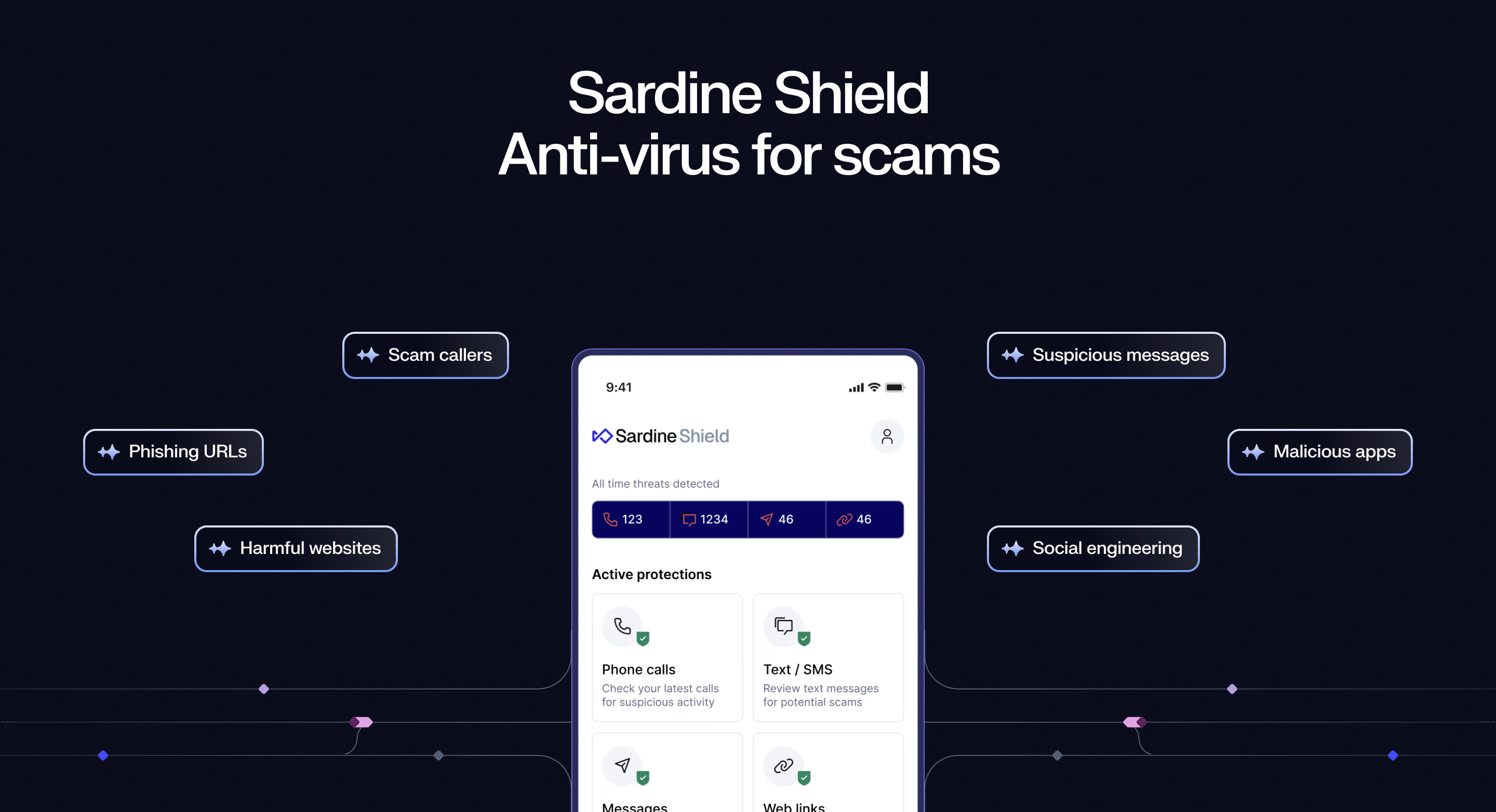
Sardine Shield
A fraud-protection app that has to earn trust before asking for sensitive permissions.
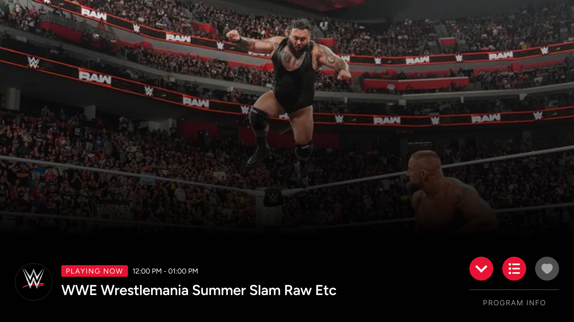
Kogan TV+
A full streaming experience controlled by five remote buttons only.
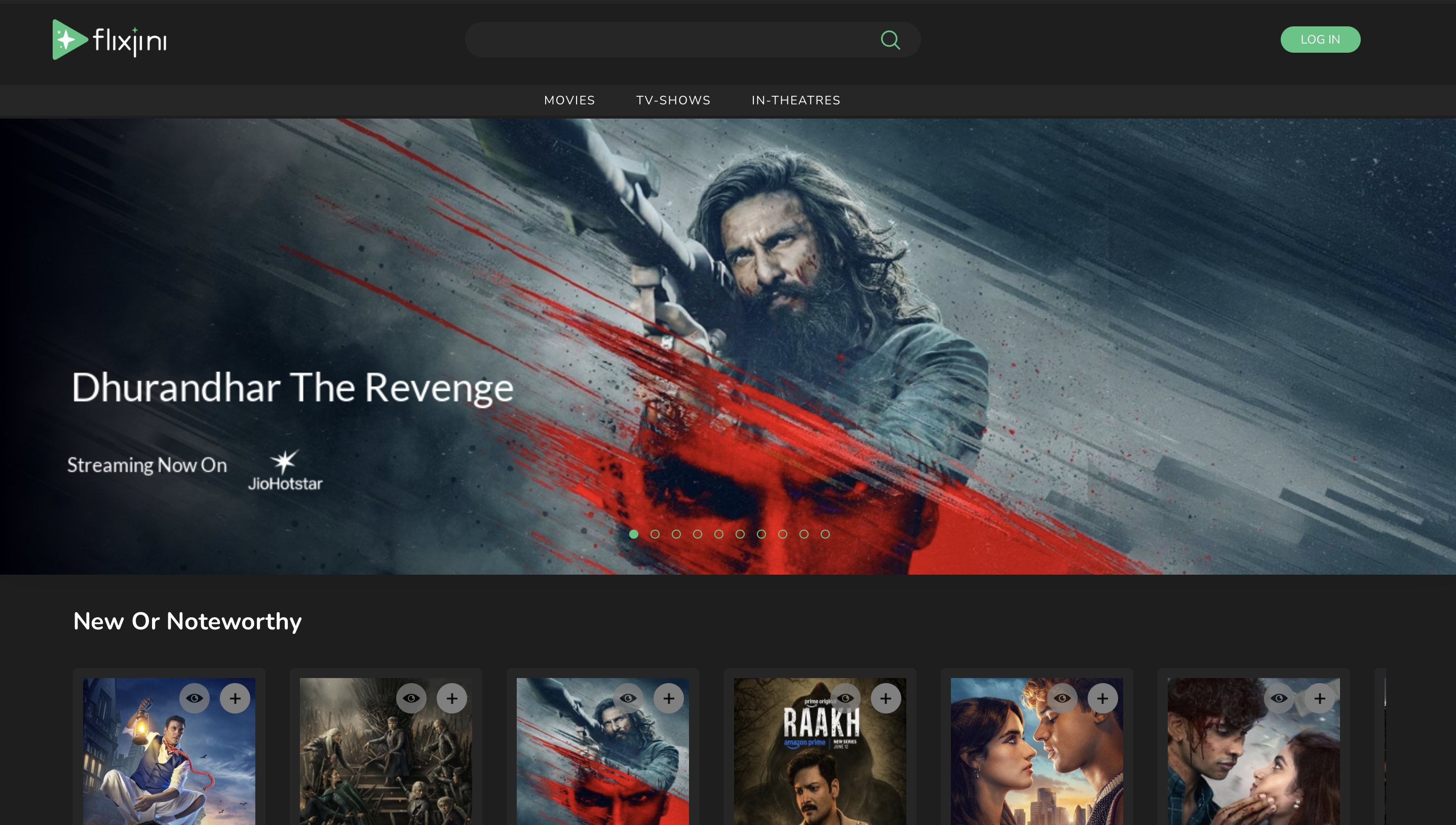
Flixjini
A discovery platform across five platforms, white-labeled for 10+ partners.
I've spent the last decade-plus as the product designer inside startup teams — often the primary designer within small product teams, working directly with whoever's building the thing. That's meant fintech apps, telecom comparison tools, an OTT platform, a cybersecurity product, and a Smart TV streaming app, often more than one at a time.
What I've learned from that setup is that most of the job happens before anyone opens Figma. Founders bring a rough problem, not a brief, and the real work is helping shape what we're actually building before deciding how it looks. I've stayed at Cheeni Labs this whole time because that's the part of the job I like most — being close enough to the decision to influence it.
I've started using AI tools early in projects, mostly to generate and stress-test more directions before narrowing down. It's changed how fast I can explore, not what I'm trying to find.
Based in Chennai. Tamil is my first language; I work in English.
How I Work
Roughly how a project moves from a founder's rough idea to something shipped.
Discovery
Understanding the problem directly from founders before any screen exists.
Product Thinking
Scoping what we're actually building, and what we're deliberately not building yet.
Wireframes
Structure and flow first, before visual decisions.
Prototype
Increasingly using AI-assisted exploration to test more directions early.
Validation
Internal QA and testing — often before public release, not just after.
Developer Collaboration
Working directly with engineers, sometimes contributing front-end implementation myself.
QA
Testing real builds on real hardware where relevant, not just design files.
Launch
Shipped, then handed to maintenance — or, in Sardine's case, an ongoing relationship.
Contact
Let's talk about what you're building.
Open to senior product design roles and select collaborations — especially teams working close to founders, with real product ambiguity to sort through.
Earning the right to ask for permissions before earning anything else.
Challenge
The app's entire value depends on permissions it has no automatic right to — contacts, phone, call logs, SMS, notifications, display-over-other-apps. Without them, it can't function. Asking before earning trust kills adoption.
Context
Sardine already had a live product with its own design system. The job wasn't to design something new in isolation — it was to extend an existing system without breaking it, as an outside contributor.
Constraints
No formal limits were set on creative direction. As a first international client relationship, where personal judgment ended and Sardine's conventions began wasn't written anywhere — it had to be learned through the relationship itself.
Role & Contribution
The first version of onboarding asked for every permission directly, up front. Internal testing — before any public release — showed why this failed: users weren't refusing out of caution, they simply didn't understand what they'd get in return.
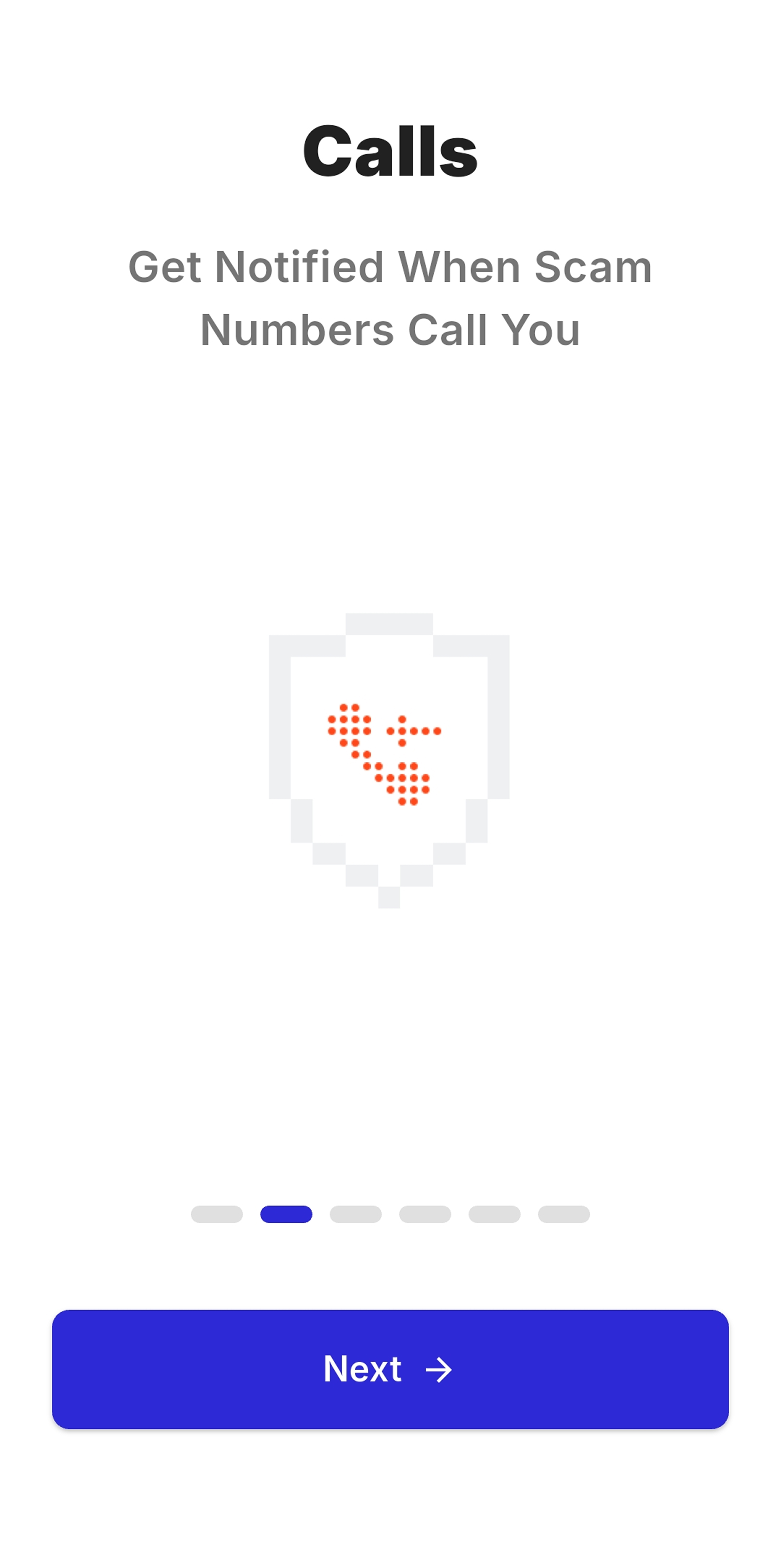
The redesign reordered the logic: explain the outcome first, then ask. After login, a per-category status view makes the cost of refusing concrete — a "not protected" label on the calls tab, for instance, tied directly to the specific permission still missing.
Beyond the core product, Dinesh designed Sardine's first public marketing site and used AI tools during early ideation to test more directions before bringing work into formal review.
.jpg)
Design Decisions & Iterations
One disagreement defined a phase of the project. An early dashboard included a circular meter showing an overall protection score — 0–40% not protected, 40–70% warning, 70–100% protected — sitting above an existing breakdown of stats per category (e.g. "Calls: 120 stopped"). Sardine's team felt the radial visualization didn't fit their minimal pattern. They asked for it to be cut entirely rather than restyled, keeping the category breakdown and moving it to the top.
Cut before public release after internal QA.
Outcome explained first. Status made visible and specific.
"They didn't just want it redrawn. They wanted the idea of a single score gone — and kept the breakdown that was already working."
Challenges
Two distinct ones: building enough trust to ask for unusually invasive permissions before the product has proven anything, and learning — in real time, on a first international client relationship — where personal design authority ended and an existing system's conventions began.
Outcome
Live, in active development, with continued contribution across multiple feature cycles since 2025.
Reflection & Lessons Learned
The score concept didn't survive in this product — Sardine moved away from it entirely, not just its visual style. A similar single-score idea has since shown up in other Sardine products; whether that traces back to this work isn't something to claim, just something worth noticing.
Working as an outside designer inside someone else's live system means the job is sometimes to be told no — and the simplification that follows can be the more disciplined outcome, even when it isn't the first instinct.
Designing for a remote with five buttons and no pointer.
Challenge
A complete streaming experience controlled only by up, down, left, right and OK. No touch, no hover, no pointer — every interaction had to work within that limit.
Context
Built as an extension of Flixjini's existing FAST platform rather than from scratch — a direction set by the CEO, designed for a ten-foot viewing distance and tested across multiple real TV sizes.
Constraints
Every interaction had to be validated on real Kogan TV hardware before it counted as finished — not just approved as a design file.
Role & Contribution
The original direction called for four-directional navigation around a central player — content name and channel up top, controls below, with a separate set of navigation buttons on each of four sides. In practice it failed on two fronts: it was hard for engineering to make feel smooth, and slow for users — reaching a simple action like opening the EPG took several sequential steps.
Dinesh raised the constraint directly and proposed an alternative: a single horizontal row of icon CTAs in the bottom-right, next to play/pause, navigable left-to-right with one consistent focus state. Fewer steps, one model instead of four, and feasible to build well.
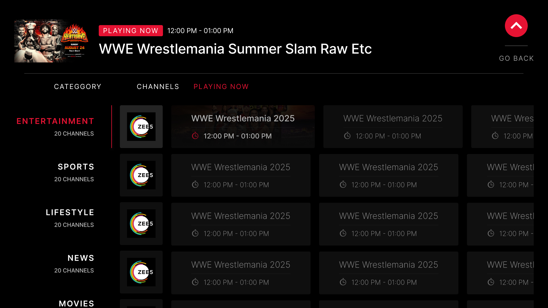
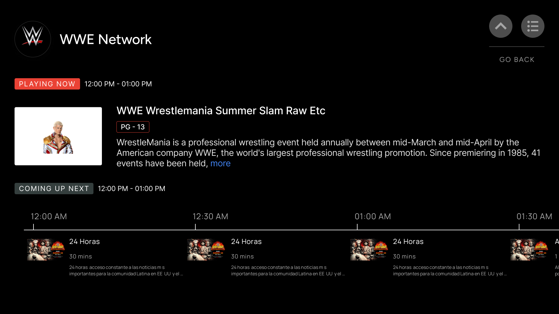
Design Decisions — Simplifying to five buttons
The core decision of this project was reducing four separate navigation zones to one. With only five physical buttons available, every additional navigation zone multiplies the number of focus jumps needed to reach an action — the four-way model meant a user pressing in any direction first had to discover which of four button sets was now active before doing anything useful.
Collapsing this to a single row meant one mental model: left and right always move along the same row, OK always confirms the current icon. That consistency is what made the interaction learnable in a few seconds on a remote with no labels beyond directional arrows.
Four separate button sets. Multiple steps to reach one action.
One row, bottom-right, beside play/pause. One focus ring, left-right only.
Iterations
Dinesh personally QA'd builds on real Kogan TVs at every checkpoint alongside the dev team, rather than relying on design-file approval. The 4-way navigation was the one interaction that changed most visibly as a result — replaced once it was clear the issue wasn't taste, it was step count and feasibility.
Challenges
Changing a CEO-originated direction required evidence, not opinion — engineering difficulty and step count, demonstrated on real hardware. Validating every interaction repeatedly, rather than assuming a design file translates directly to a TV remote in someone's hand.
Outcome
Shipped and live on Kogan Google TV devices in Australia, publicly launched as a free ad-supported platform in November 2025. Design and frontend involvement ended at launch; the backend team now manages ongoing maintenance.
Reflection & Lessons Learned
The strongest decision here wasn't adding something — it was simplifying a requested four-direction system down to one, backed by evidence rather than instinct. On hardware-constrained platforms, "this works in the design file" and "this works in someone's hand on a real TV" are different claims.
One product, ten partner deployments, one consistent core.
Challenge
Help users decide what to watch across a fragmented streaming landscape, then replicate that experience for 10+ partner deployments without losing a coherent core product.
Context
A homepage built from curated content rails and a showcase, plus detail, genre, actor, and tag pages — alongside a white-label dashboard partners use to configure their own deployment.
Constraints
Each partner needed real flexibility — branding, content, eventually their own uploaded VOD — without fragmenting the interaction model holding the core product together.
Discovery, Across Five Platforms
Search, content discovery, and detail pages designed once and adapted across web, Android, iOS, Smart TV, and tablet.
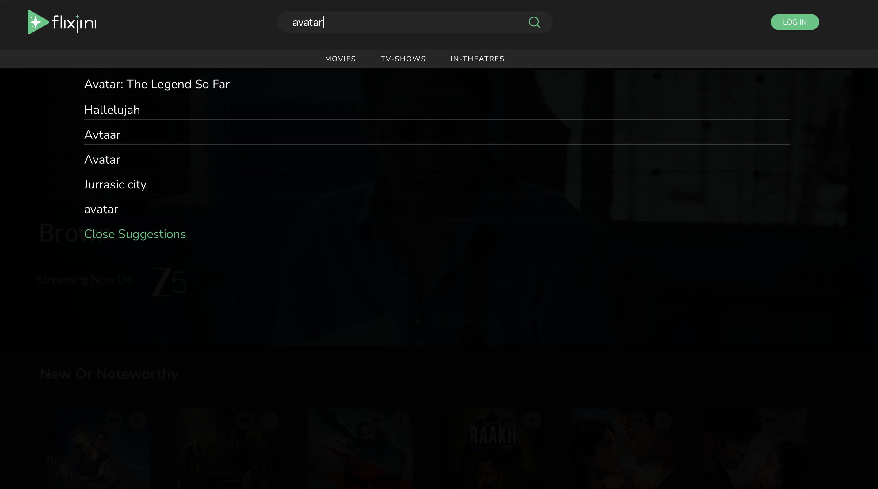
Search
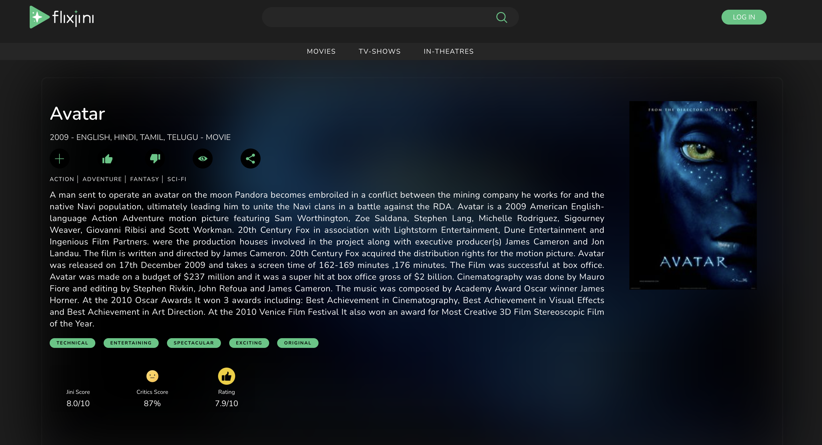
Details
Smart TV
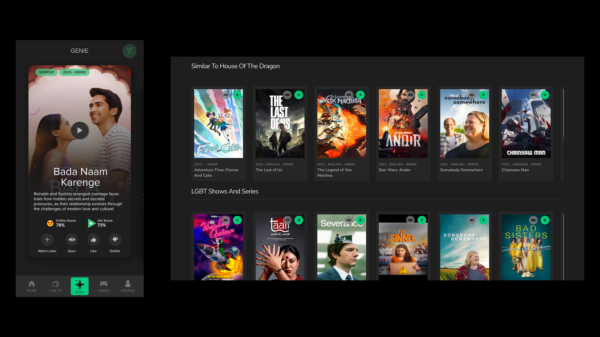
Recommendations
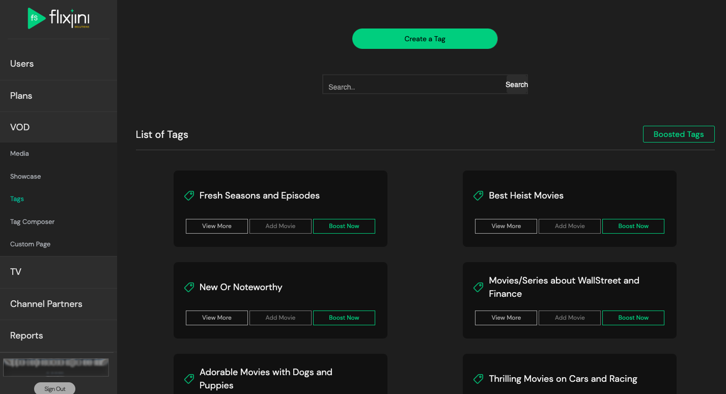
One feature worth detailing: the Flixjini Score — an in-house alternative to a generic rating aggregate, calculated by the backend team from multiple existing ratings and reviews, used as a primary signal for whether to watch something. Backend-driven tagging beyond standard genre categories powers a swipe-style discovery feed and a saved custom-filter system that surfaces back into the homepage rails.
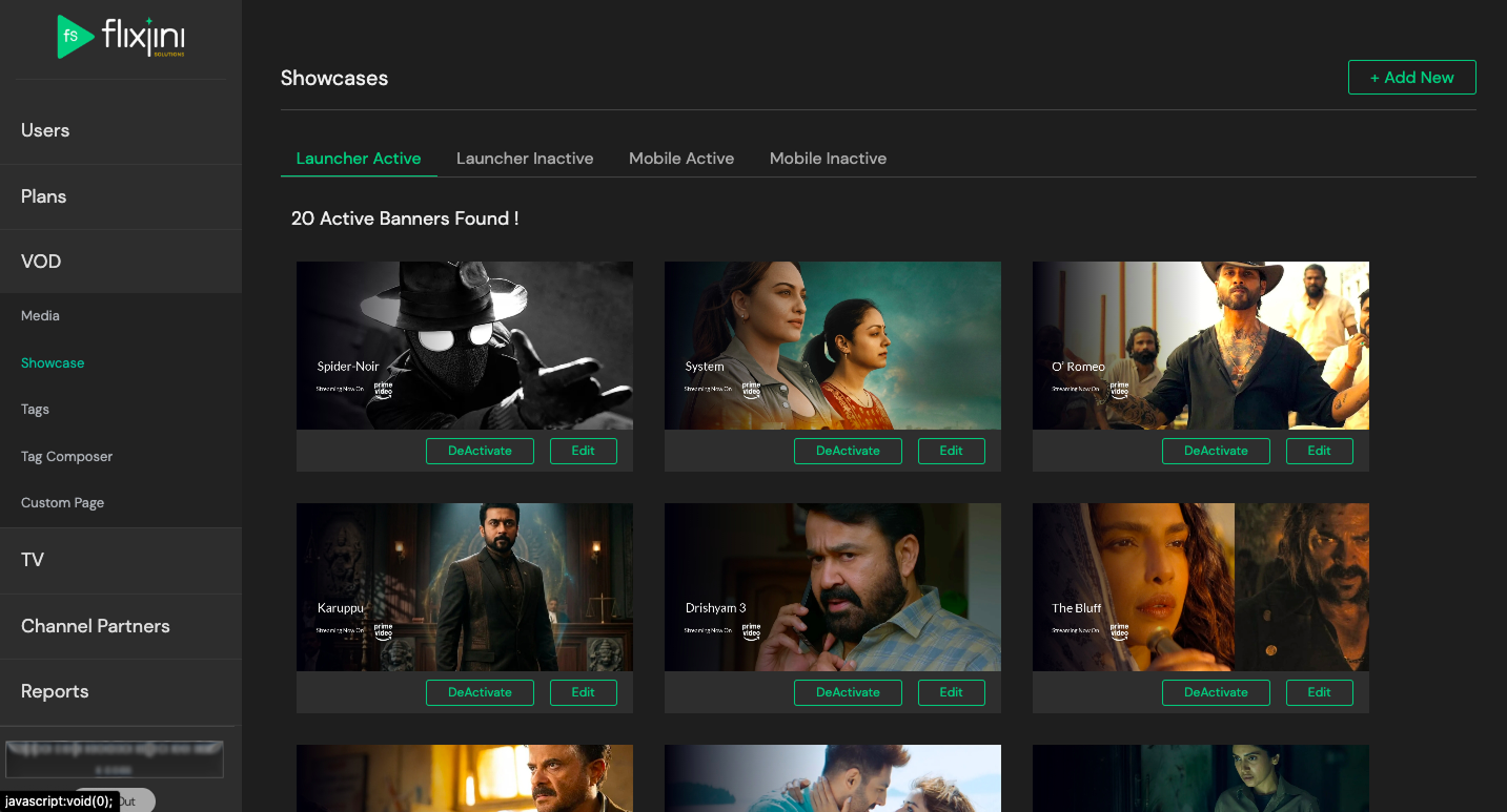
White-Label Dashboard & Partner Experience
Partners (data team-managed deployments for names like Amazon, Flipkart, and Mobikwik) configure their own instance directly — branding, content selection, user and plan-activation controls. The dashboard later expanded into a VOD feature, letting partners upload and manage their own content rather than relying solely on the aggregated catalog.
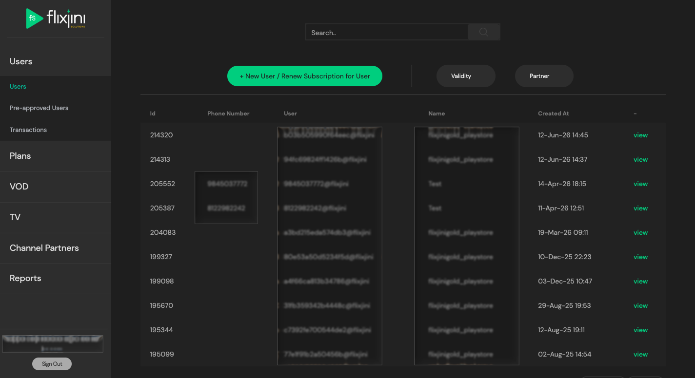
White-label dashboard
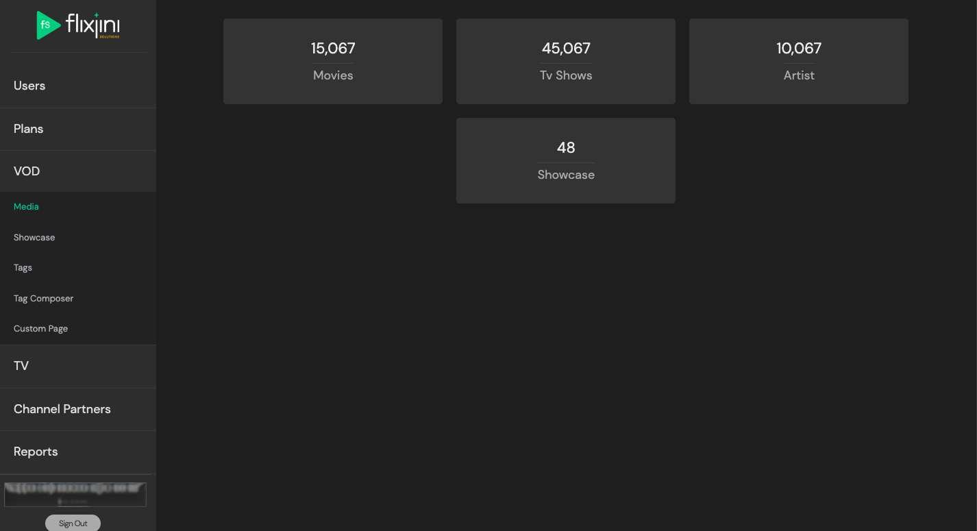
Partner VOD upload
Design Decisions & Challenges
Ownership here looked different from Sardine or Kogan TV+: end-to-end direction early on, shifting toward a more collaborative process as the team and partner network grew — more opinions in the room, not a single point of decision-making.
Outcome
Live, serving 2M+ monthly users across a growing partner network. Now maintained on an as-needed basis — typically new assets for partner-specific plan benefits, rather than active new design work.
Reflection & Lessons Learned
A white-label product's hardest constraint isn't visual consistency — it's deciding which parts of the experience are actually load-bearing (the scoring system, the tagging model) versus which parts each partner should be free to make their own.